


I take most of my lunch breaks walking around Madison Square Park.
It’s a small patch of green in the middle of downtown Manhattan, surrounded by buildings that tell the story of the city’s past and present.


The New York Life Building, with its gold, pyramid-shaped roof, sits near the ornate, stone-clad Appellate Division Courthouse.


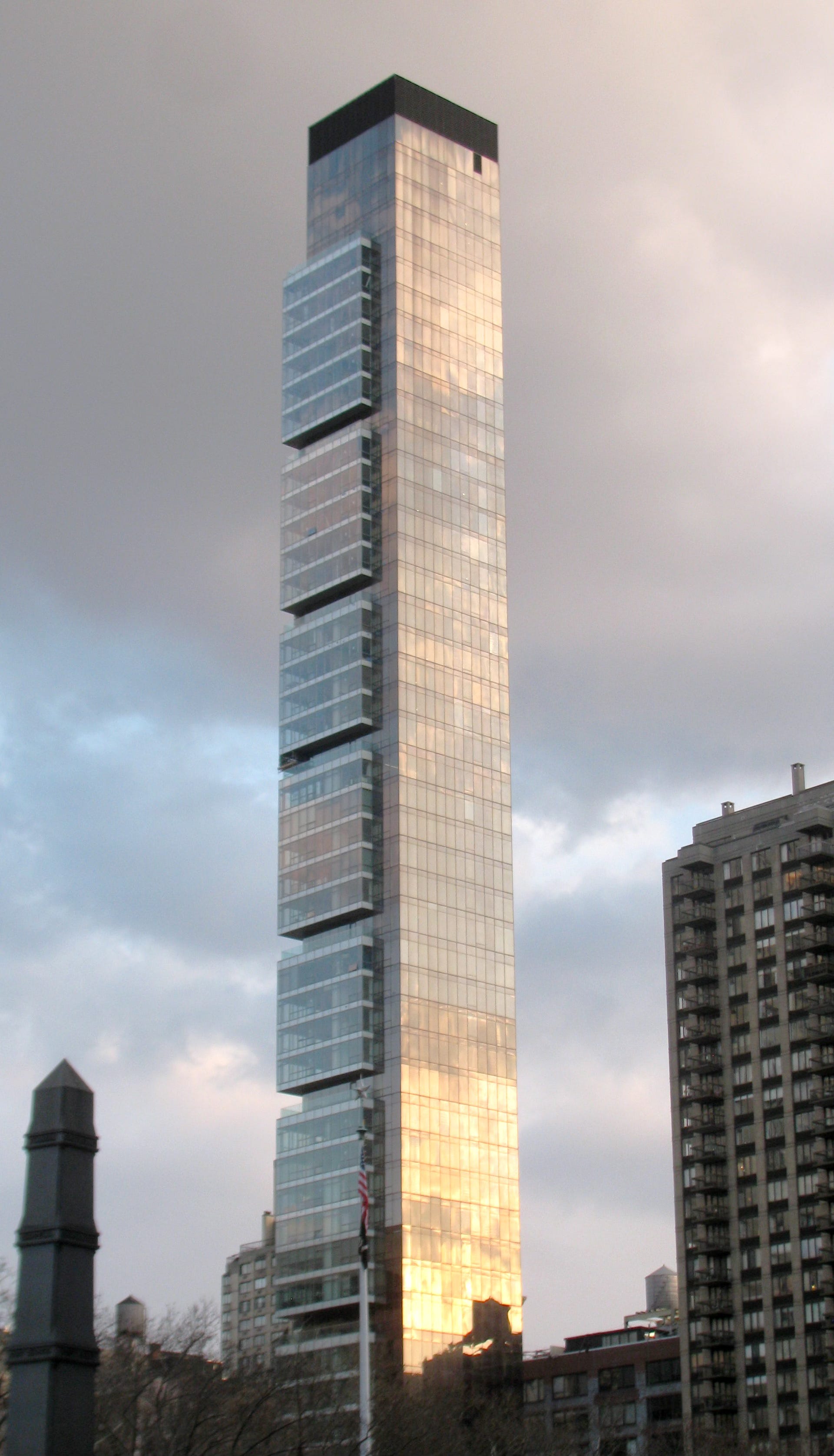
Just across from them, the sleek glass of One Madison reflects the sky—a 50-story monument to modern minimalism and, most likely, mostly-vacant investment properties. Now, another just like it is rising on the north end of the park.
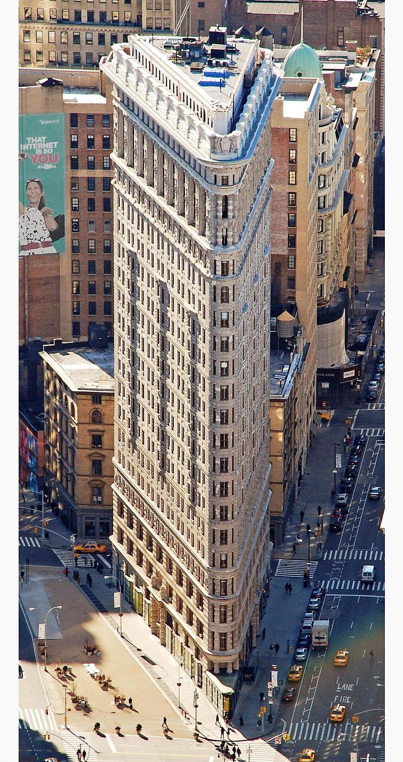
And then, of course, there’s the Flatiron Building, which has been covered in scaffolding for what feels like forever. It is my favorite building in the world.
None of these buildings were designed to match each other, yet they stand together, each representing a different era and architectural philosophy.
That’s the thing about cities—they accumulate.
Like a sedimentary rock, layers of a city build up over time, each one preserving a distinct moment in history. You can walk through New York and literally see different eras stacked on top of each other—ornate 19th-century façades giving way to sleek glass towers, brick warehouses transformed into loft apartments, entire blocks where the old and the new sit side by side.
Architecture, at its best, doesn’t erase the past to make way for the future; it embraces and builds upon it.
That’s partly because buildings can’t just be ‘updated’ overnight.
Once they’re built, they stay for a while. They have to endure new trends, new ideas, and new technologies.
Digital spaces, on the other hand, can be redesigned with the click of a button.
Digital Design is All Starting to Look the Same
For some reason, we don’t allow digital spaces to evolve this way. Instead of layering different styles, we constantly wipe the slate clean, flattening, streamlining, and optimizing everything until it all starts to look the same.
Take a look at my phone’s home screen.


All of these logos are starting to blend together. Even the guts of these apps—their UI, their UX, even their features—blend together too.
What was once bold and experimental quickly gets standardized. A few companies push the envelope and A/B test some new feature, and then everyone follows suit.
There’s something beautiful lost in this trend.
A Gallery of Styles
Most apps, when placed side by side, start to blur together.
But I want Day by Data to feel more like Madison Square Park—where different styles, different influences, and different aesthetics exist in the same space, telling a richer story because of it.
And maybe this is where the difference between design and art really shows.
Design is often about best practices—streamlining, improving usability, refining the experience so it’s as frictionless as possible. And for good reason. A well-designed interface should feel intuitive, guiding users without them needing to think about it.
But in that pursuit of efficiency, a design’s personality can sometimes get lost.
Art, on the other hand, doesn’t optimize. It expresses.
It embraces texture, contrast, and tension. It prioritizes feeling over function.
That’s why nostalgia plays such a powerful role in aesthetics.
Old UI styles—8-bit graphics, skeuomorphic buttons, pixel fonts—these weren’t just functional; they had character. They carried texture.
So where do we draw the line? How much efficiency is too much? How much expression is enough?
With Day by Data and all of my art, I want to strike that balance.
The app should feel modern, but it should also feel personal. I made the intentional decision for each widget to have its own distinct style, even if that meant they didn’t "match" in the way most digital products do.

Seeing them side by side, I realized they worked because they were different. The same way a city skyline is interesting because it’s made of competing styles, not despite it.
Maybe digital design could learn something from art.
Maybe efficiency doesn’t always have to come at the cost of personality.
And maybe, instead of constantly sanding things down to a frictionless surface, we should let some of those layers show through.
Modernity has its place. But so does history. And the best design—whether in cities, apps, or anything else—isn’t just about following the latest trend. It’s about layering ideas, letting them coexist, and building something that feels like it belongs.
What I Did This Week — Apple Music, Paywalls, a new project, and Pete’s personal site
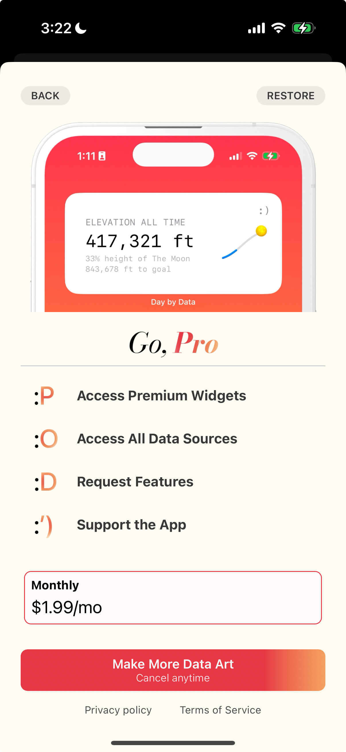
This week has mostly been spent preparing for the next release of Day by Data, complete with the widgets shown above and some new data integrations.
Apple Music fans rejoice. I was finally able to make something out of the Apple Music API.

As part of these updates, I’ll be paywalling some of the features.
To be honest, I’ve struggled with how to price my work. Part of me believes it should be free, it is your data after all. But I guess I am paywalling the art itself, not the access to your data.
If you have thoughts on the pricing, let me know ¯\_(ツ)_/¯
I also kicked off an exciting new project with a talented filmmaker and artist at the intersection of data and performance arts that I am excited to share more about in the future. Stay tuned for more here ;)
Lastly, took some time to refresh my personal site as I open up space for some more freelance work.
If you’re looking for any development or data art support, please let me know!
Something Beautiful — A Year of Growth Widget
Sam Dape and Alec released an app a few weeks ago that’s a widget to highlight how many days were left in the year.
Originally, the app launched with a minimalist design aesthetic, but this past week, they added an update to incorporate Sam’s doodles of a character or plant for each day.
It is stunning.


Sam’s one of the most impressive designers I’ve come across. He has a knack for incorporating several different styles into his work.
He also tweets about the intersection of beauty and utility a lot, which I really enjoy. One of my favorite follows. If you like my work, you’ll definitely like his too.
In the tech world, we're constantly reinventing our products. There's so little barrier to continually running A/Bs and optimizing for getting more people through that funnel/adopting/using or whatever we're indexing on.
I love your implication that it's fruitful to simply SIT in our choices for longer and let time teach you how they interact with everything else in our great world. I think that can go for art and design, and also for the building blocks of who we are. Great reminder